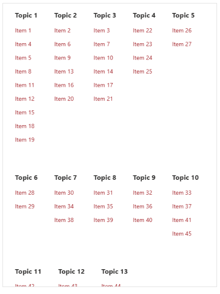
This article will show you how to maintain a list of useful links on your site and display those links to users by grouping them based on a topic, displaying them using a dynamic multi-column flex-box.
We will use:
- Data view plus as the web part displaying our content
- Custom control with a custom HTML template
- Custom style editor to achieve the responsible flex-box UI
Create the links list
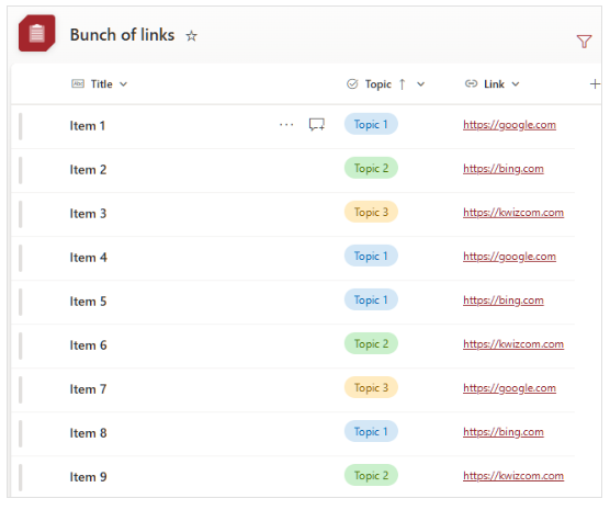
Start by creating a links list, with a topic / category column, and a link column:
Configure data view plus
Add the web part and data source
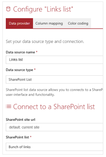
Add a data view plus web part to the page, connected to this list as the data source:
Configure the display control
Now, to configure the display control:
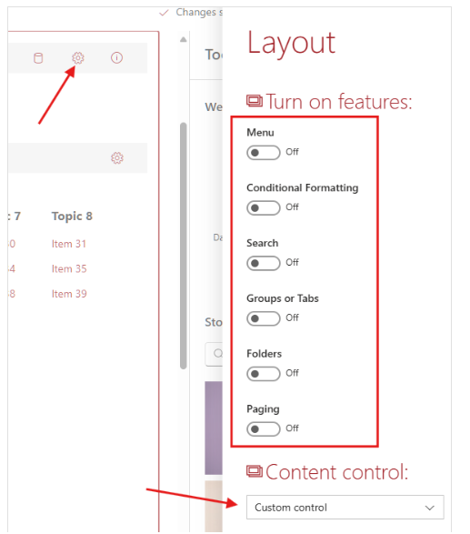
- Click on the gear icon on the top right
- Turn off all layout features
- Set the content control to custom control
Apply custom styles
Paste this CSS into the Custom Styles text box:
.flowy {
    display: flex;
    flex-direction: row;
    flex-wrap: wrap;
}
.flow-topic {
    padding: 20px;
}
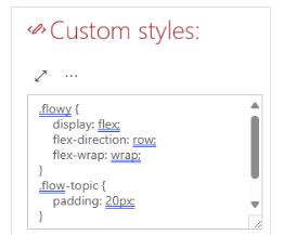
Close the layout editor panel, we are done with it for now.
Apply a custom template
Click on the gear icon to configure your custom control:
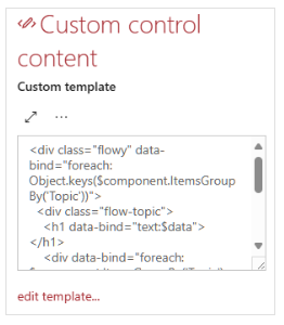
Paste this HTML into the custom template text box:
Note: we group items by the column "Topic", you may want to change that in your implementation based on how you group information.
You can apply custom sorting on the source list and list view to control the order links and categories show up
<div class="flowy" data-bind="foreach: Object.keys($component.ItemsGroupBy('Topic'))">
  <div class="flow-topic">
    <h1 data-bind="text:$data"></h1>
    <div data-bind="foreach: $component.ItemsGroupBy('Topic')[$data]">
      <a class="kw-Link" data-bind="attr:{href:$data.Link.raw.Url}">
        <p data-bind="text:$data.Title"></p>
      </a>
    </div>
  </div>
</div>
You are done!
Preview
You will end up with a view similar to this, that dynamically collapses into columns and rows based on the user's screen site: